
In healthcare, data plays a crucial role in decision-making. From hospital management to disease diagnosis, the ability to analyze and understand large volumes of information can make the difference between successful treatment and medical error. However, the amount of data generated daily in hospitals, laboratories and medical devices is overwhelming. This is where data visualization becomes an indispensable tool.
Through graphs, dashboards and interactive maps, data visualization makes it possible to transform complex figures into understandable information. A well-designed graph can help physicians to detect patterns in a patient’s evolution, epidemiologists to track disease outbreaks, and healthcare managers to optimize resource allocation.
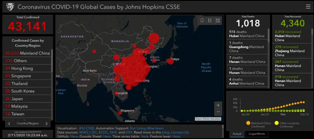
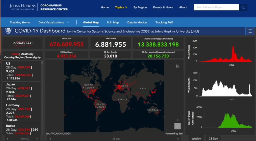
A clear example of the impact of data visualization occurred during the COVID-19 pandemic. The famous Johns Hopkins University dashboard, which showed the spread of the virus in real time, enabled governments and healthcare professionals to make informed decisions about containment, vaccine distribution and medical resource allocation. This case demonstrates how good visualization not only facilitates data interpretation but can also save lives.
1. Why is data visualization in healthcare key?
The healthcare industry generates an enormous amount of data, from electronic patient records to genomic research results. This information, in its raw form, is often voluminous and difficult to interpret. Data visualization comes into play to transform this complexity into clear and accessible information.
The benefits of data visualization in healthcare are multiple:
- Improved clinical decision making: Visualizations enable clinicians to quickly identify patterns and trends in patient data, facilitating more accurate diagnoses and more effective treatments. For example, a line graph can show the evolution of glucose levels in a diabetic patient, allowing insulin dosage to be adjusted more precisely.
- Reducing medical errors: By presenting information clearly and concisely, visualizations help reduce the risk of errors in data interpretation and decision making. A dashboard with visual alerts can warn clinicians of potential drug interactions or abnormal test results.
- Identifying patterns and trends: Data visualization facilitates the detection of patterns and trends in large data sets, which can be crucial for medical research and public health. For example, a heat map can show the geographic distribution of a disease, allowing high-risk areas to be identified and preventive measures to be taken.
- Optimizing healthcare management: Dashboards and interactive visualizations allow hospital and clinic managers to monitor the performance of their services, identify areas for improvement and optimize resource allocation.
In short, data visualization is an essential tool for transforming information into useful knowledge, which translates into better medical care and greater efficiency in the healthcare sector.
2. Most frequently used tools in medical data visualization.
Medical data visualization requires versatile tools that adapt to various needs, from exploratory analysis to the creation of interactive and customized visualizations. Below, we compare some of the most commonly used tools and languages:
Medical data visualization tools.
2.1. Tableau and Power BI
Tableau and Power BI are leading tools for creating interactive dashboards and exploratory data analysis. Both allow users, even without deep programming skills, to develop complex visualizations and share them easily.
Tableau: Stands out for its ability to handle large volumes of data and its wide range of visualization options. It is especially valued in enterprise environments for its ease of use and power.

https://www.tableau.com/dashboard/dashboard-examples?utm_source=chatgpt.com
Power BI: Integrated into the Microsoft ecosystem, Power BI offers seamless integration with other Microsoft tools, such as Excel and Azure. Its intuitive interface and real-time analytics capabilities make it a popular choice for organizations already using Microsoft products.
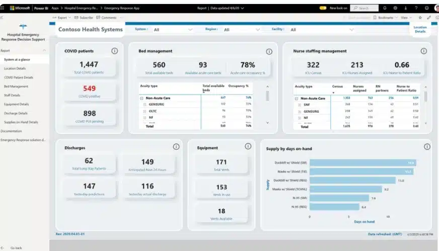
https://blog.coupler.io/es/ejemplos-cuadros-de-mando-power-bi/?utm_source=chatgpt.com
2.2. Python libraries: Matplotlib, Seaborn and Plotly
Python offers several libraries for data visualization, each with its own particularities:
- Matplotlib: This is the most basic and versatile visualization library in Python. It allows to create from simple plots to complex visualizations, offering detailed control over each element of the plot.
- Seaborn: Built on Matplotlib, Seaborn simplifies the creation of attractive and informative statistical visualizations. It facilitates the generation of complex charts with less code and improved aesthetics.
- Plotly: Known for its interactive capabilities, Plotly allows users to create dynamic visualizations that can be easily integrated into web applications. It is especially useful for dashboards and interactive exploratory analysis.
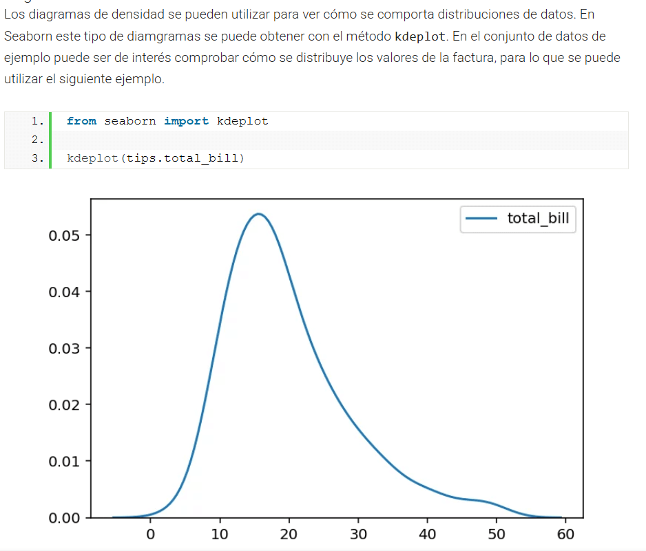
https://www.analyticslane.com/2018/07/20/visualizacion-de-datos-con-seaborn
2.3. R libraries: ggplot2 and Shiny
R is another language widely used in data analysis, especially in academia and research.
- ggplot2: Based on the graph grammar, ggplot2 allows users to build complex visualizations in a coherent and systematic way. It is highly valued for its ability to create detailed statistical graphs.
Shiny: An R package that facilitates the construction of interactive web applications for data visualization. It allows users to deploy dashboards and analysis tools without requiring deep web development skills.

2.4. D3.js
For custom web visualizations, D3.js (Data-Driven Documents) is a JavaScript library for manipulating data-driven documents. It offers full flexibility to create interactive visualizations tailored to specific needs and is widely used in data journalism and interactive web projects.
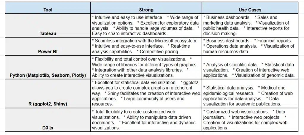
3. Types of visualization in healthcare and their applications.
Healthcare data visualization encompasses a wide range of techniques, each with specific applications to address different needs. Below, we explore some of the most commonly used types of visualization and their applications:
3.1. Line and bar charts.
Applications:
- Tracking hospital metrics: These charts are ideal for monitoring key indicators such as bed occupancy, number of admissions and discharges, and disease progression over time. For example, a line chart can show the monthly trend of cases of a specific disease, while a bar chart can compare the occupancy of different departments in a hospital.
Benefits:
- They facilitate the identification of temporal trends and patterns.
- They allow direct comparisons between different categories or periods.
3.2. Heat maps
Applications:
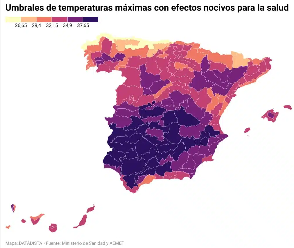
- Detection of areas with increased disease incidence: Heat maps use color variations to represent the density or frequency of cases in different geographic areas. They are useful for identifying regions with high infection rates or disease prevalence, which facilitates the implementation of preventive measures and the efficient allocation of health resources.
Benefits:
- They provide a geospatial view of the data, highlighting critical areas.
- Assist in the planning of specific location-based interventions.
3.3. Sankey diagrams
Applications:
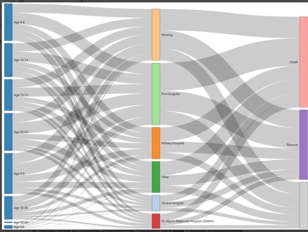
- Hospital patient flow: These diagrams illustrate the movement of patients from admission to discharge, passing through different departments or units. They allow to visualize common routes, identify bottlenecks and analyze the efficiency of hospital workflow.
Benefits:
- They provide a clear representation of complex and multiphase processes.
- Facilitate the identification of areas requiring improvement in hospital management.
https://www.epirhandbook.com/es/new_pages/diagrams.es.html
3.4. Interactive Dashboards.
Applications:
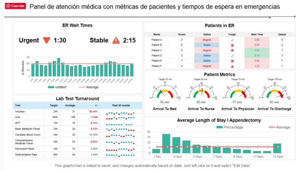
- Real-time monitoring of public health data: dashboards consolidate multiple visualizations into a single interface, allowing healthcare professionals to access up-to-date information on various indicators, such as infection rates, resource availability, and intervention outcomes.
Benefits:
- They facilitate informed decision making by providing up-to-date and easily accessible data.
- Enable rapid adaptation to changes in the health situation.
https://www.datacamp.com/es/blog/9-power-bi-dashboard-examples
4. Success stories in healthcare data visualization.
Data visualization has proven to be a powerful tool in the fight against diseases and the improvement of medical care. Here are some outstanding success stories:
4.1. COVID-19 and the WHO and Johns Hopkins dashboards
Application: During the COVID-19 pandemic, interactive dashboards provided real-time information on the spread of the virus, facilitating governmental decision-making.
- Screenshot of dashboard: Images from the Johns Hopkins University dashboard, which showed confirmed cases, recoveries and deaths globally.
coronavirus.jhu.edu
4.2. Visualization of genomic data.
Application: Visual representation of genomic data has facilitated the personalization of medical treatments by allowing the identification of specific mutations and their relationship with diseases.

5. Challenges and best practices in medical data visualization.

Medical data visualization offers great potential, but it also poses significant challenges that must be addressed to ensure its effectiveness and ethics. Below, we explore some of the key challenges and best practices to overcome them:
5.1. Avoiding bias and misinterpretation.
Challenge: Medical data can be complex and, if not presented appropriately, can lead to misinterpretation or bias.
Best practice:
- Contextualize data: Provide additional information to help correctly interpret visualizations, avoiding hasty conclusions.
- Transparency in methodology: Clearly explain how the data were collected and processed so that users understand the limitations and scope of the information presented.
5.2. Privacy and security.
Challenge: Medical information is highly sensitive, and its visualization must comply with strict privacy and security regulations, such as GDPR in Europe and HIPAA in the United States.
Best practice:
- Data anonymization: Removing or encrypting information that can identify patients to protect their privacy.
- Access control: Restrict access to sensitive data to authorized and trained personnel only.
- Regulatory compliance: Ensure that all data handling and viewing practices comply with applicable regulations, such as GDPR and HIPAA.
If you want to know more about regulations, ethics and privacy in data access my Blog article Big Data and AI in the healthcare sector: ethics and privacy in data management at the following link: https://soymartagan.com/en/healthcare-ethics-and-privacy-in-data/
5.3. Simplicity and clarity.
Challenge: Complex or poorly designed visualizations can confuse users and make it difficult to make informed decisions.
Best practices:
- Intuitive design: Create visualizations that are easy to understand, using appropriate graphics that convey information effectively.
- Focus on the essentials: Avoid information overload and focus on the data most relevant to the purpose of the visualization.
- Validation with end users: Test visualizations with the healthcare professionals who will use them to ensure that they are useful and understandable.
Addressing these challenges by implementing best practices is critical to ensuring that medical data visualization is an effective and reliable tool in the healthcare sector.
6. Conclusion.
Throughout this article, we have explored the transformative power of data visualization in healthcare. We have seen how the ability to convert complex data into clear and concise visual information can improve clinical decision making, drive medical research, and optimize public health management.
In the future, healthcare data visualization will be further integrated with artificial intelligence and real-time data. AI will enable the generation of more intelligent and personalized visualizations, while real-time data will facilitate disease tracking and response to health emergencies. We are on the brink of a new era in which data visualization will play an even more crucial role in improving people’s health and well-being.
As healthcare professionals, we have a responsibility to harness the full potential of data visualization. But how can we get started? Here are some recommendations:
- Become familiar with visualization tools: Explore platforms such as Tableau, Power BI and Python libraries such as Matplotlib and Seaborn.
- Learn best practices: Study visualization design principles and how to avoid bias and misinterpretation.
- Collaborate with data experts: Work with data scientists and analysts to develop effective visualizations.
- Promote data culture: Encourage the use of data and visualizations in clinical decision making and research.
Data visualization is a powerful tool that can transform the way we understand and use medical information. By adopting these practices, we can contribute to a future in which healthcare is more accurate, personalized and efficient.zamos la información médica. Al adoptar estas prácticas, podemos contribuir a un futuro en el que la atención médica sea más precisa, personalizada y eficiente.
7. Bibliography:
Organización Mundial de la Salud (OMS). (s.f.). Datos sanitarios. Recuperado de: [https://data.who.int/es](https://data.who.int/es)
Centros para el Control y la Prevención de Enfermedades (CDC). (s.f.). Datos y estadísticas. Recuperado de: [https://data.cdc.gov/](https://data.cdc.gov/)
Campus Health Tech (2023). Visualización de datos médicos. Recuperado de: https://campushealthtech.com/blog/visualizacion-de-datos-medicos/
New Medical Economics (2023).
La importancia de los datos sanitarios y su seguridad en un contexto de calidad asistencial y mejora continua. Recuperado de: https://www.newmedicaleconomics.es/el-termometro/la-importancia-de-los-datos-sanitarios-y-su-seguridad-en-un-contexto-de-calidad-asistencial-y-mejora-continua/
The most popular data visualization tools with comparisons: moonlighto2.medium.com
Top 7 data visualization Libraries in 2024. datahen.com
The essential guide to R and Python Libraries for Data Visualization. Medium
Zeus.vision. (s.f.). Guía de visualización de datos: qué es y ejemplos prácticos. Recuperado de
Zeus Vision
Tableau. (s.f.). ¿Qué es la visualización de datos? Definición, ejemplos y recursos. Recuperado de
Tableau
EditVerse. (s.f.). Combinando tipos de gráficos: creando visualizaciones compuestas efectivas. Recuperado de
editverse.com
Datos.gob.es. (s.f.). Visualización de datos. Recuperado de
Datos.gob.es
Blanco, J. I. (s.f.). Tipos de visualizaciones aplicables en ciencia de datos, analítica y estadística. Recuperado de
Jorge Iblanco
Generalitat de Catalunya. (s.f.). Guía de visualización de datos. Recuperado de
Atenció Ciutadana
Banco Interamericano de Desarrollo. (s.f.). Caja de herramientas para la visualización de datos de las oficinas nacionales de estadística. Recuperado de
Publicaciones IADB
Coupler.io. (s.f.). Panel de visualización de datos: tipos, ejemplos y plantillas. Recuperado de
Blog Coupler
Ingenio Virtual. (s.f.). Tipos de gráficos y diagramas para la visualización de datos. Recuperado de
ingeniovirtual.com
Telefónica Tech. (s.f.). Visualización de datos: elección del gráfico adecuado. Recuperado de Telefonica Tech
Gestión de datos de salud: desafíos y mejores prácticas. Astera
Privacidad y seguridad de la información médica. Radiology Info
Desafíos y estrategias en la gestión de registros médicos. Access Corp
Aviso de privacidad HIPAA. priviahealth.com
HIPAA y la ley de Privacidad. caseguard.com
Translated with DeepL.com (free version)